Amidst the cruelty and chaos of president trump and the current federal administration in the United States, December 2025 brought news of a font change for documents in the State Department. A font change of course is small in comparison to the local, national, and global harms of the administration.
Yet I think the “font flip-flop” is still important for several reason, and I think this guest article by Dr Aina G. Irbe matters.
First, what we could call the font fiasco is a reminder that to build an ethical digital world that includes disabled people, small thing matter as well as large ones.
Second, rolling back the accessible font shows the fragility of accessibility wins. Whether in the private or public sector our successes can easily disappear without intention, attention, systems and culture change.
Third, the current administration’s decision to go back to a less readable font is a reminder of it’s callous disregard of the needs of disabled people and the public generally on all issues, no matter how large, no matter how small.
As I do my work I don’t want to ever forget that. I want to remember that in these times, our commitment to an ethical inclusive world, our work in accessibility whatever our role, is resistance.
Below is a guest article by Dr. Aina G. Irbe. Dr. Irbe was working at the State Department in 2023 when the agency, under President Biden, modernized its font by choosing the more accessible Calibri. She shares her thoughts on the meaning of the about-face and the reduced access caused by the decision to return to Times New Roman.
Jump to:
share on linkedinshare on bluesky
Dr. Aina G. Irbe’s Guest Article on the US State Department’s Font Flip-Flp
I was there
I was working at the Department of State when we transitioned away from Times New Roman to a sans-serif font in 2023. Sans serif means “without serif.” Serif is a flourish, or decorative line or stroke added to the main lines of a letter.
The change was remarkably well-received. Staff appreciated the improved readability, especially in digital documents and on screens where we spent most of our time. The modern, clean appearance also better reflected how we communicated in the 21st century.
What many people don’t realize is the undertaking that font transition represented. It wasn’t simply flipping a switch. Staff had to update templates, modify style guides, and adjust relevant documents and forms.
But it was worth it.
Though I had left the State Department before this recent reversal, I was dismayed to learn that on December 11, 2025, Secretary of State Marco Rubio mandated a return to Times New Roman for all official State Department documents.
What Happened
According to a December 9, 2025 cable sent to U.S. diplomatic posts worldwide, Rubio ordered the immediate switch back to 14-point Times New Roman, citing the need to “restore decorum and professionalism to the Department’s written work products.” The directive characterized the 2023 change to Calibri as “yet another wasteful DEIA program.” (The initials DEIA stand for Diversity, Equity, Inclusion, and Accessibility.)
The official State Department statement framed the reversal as aligning with President Trump’s “One Voice for America’s Foreign Relations” directive, emphasizing the need to “present a unified, professional voice in all communications.” Supporters of the change have positioned the return to Times New Roman as a return to tradition—a familiar, long-standing symbol of official government communication.
In this framing, tradition itself is treated as a proxy for professionalism, even when modern work environments, technologies, and accessibility needs have fundamentally changed.
The Accessibility Question
Here’s what makes this particularly frustrating: the original 2023 change wasn’t arbitrary or politically motivated. Then-Secretary of State Antony Blinken made the switch to Calibri based on recommendations from the Department’s diversity and disability groups. The reasoning was sound. Sans-serif fonts like Calibri are generally easier to read, particularly for people with dyslexia or low vision.
As Kristen Shinohara, who leads the Center for Accessibility and Inclusion Research at the Rochester Institute of Technology, explained to NPR:
The decorative flourishes on serif fonts like Times New Roman “can make the lettering harder to read” and “this impact can be more severe for people with learning or reading disabilities like dyslexia or for people with low vision.” State Department trades Calibri for Times New Roman quoting Kristen Shinohara
Times New Roman was designed in the 1920s for a British newspaper—optimized for dense print text, not the digital screens where we do most of our work today. Calibri, on the other hand, was specifically designed in 2004 for screen reading.
The Real Cost
Reversing course back to Times New Roman means all that effort will have been for nothing. Significant time and resources will be spent undoing a change that was working well (although older documents will not have to be redone). And the change will create new inefficiencies and barriers in the process.
Think about what this means practically: updating templates and modifying style guides — again. And for what? To send a political message by dismantling a “DEIA program” that was actually improving how people read and work with documents?
Lucas de Groot, the Dutch designer who created Calibri, was quoted on the BBC websitesaying the reversal was both “sad and hilarious,” noting that “Calibri was designed to facilitate reading on modern computer screens—it was chosen to replace Times New Roman—the typeface that Rubio wants to go back to now.”
The Bottom Line
Font choices might seem trivial, but they matter. They affect how easily people can read and comprehend information. They impact productivity. And yes, they can create barriers for people with disabilities.
The 2023 change to Calibri was thoughtful, research-based, and well-received by those of us who actually worked with these documents every day. Reversing it accomplishes nothing except wasting resources, not saving money, and making documents harder to read for some of our colleagues and the public we serve.
Sometimes “returning to tradition” is just a fancy way of saying “going backward.”
About Dr. Aina G. Irbe
Dr. Aina Irbe is an award-winning Global Learning Strategist with a PhD in Instructional Design and Educational Technology, specializing in digital accessibility, inclusion, Universal Design for Learning, and driving transformative digital education initiatives across global enterprises, government, and social impact sectors. She is also a Certified Professional in Accessibility Core Competencies (CPACC) through the International Association of Accessibility Professionals (IAAP), has served as an adjunct professor at George Washington University and has co-authored a chapter on accessible e-learning in the International Handbook of E-learning.
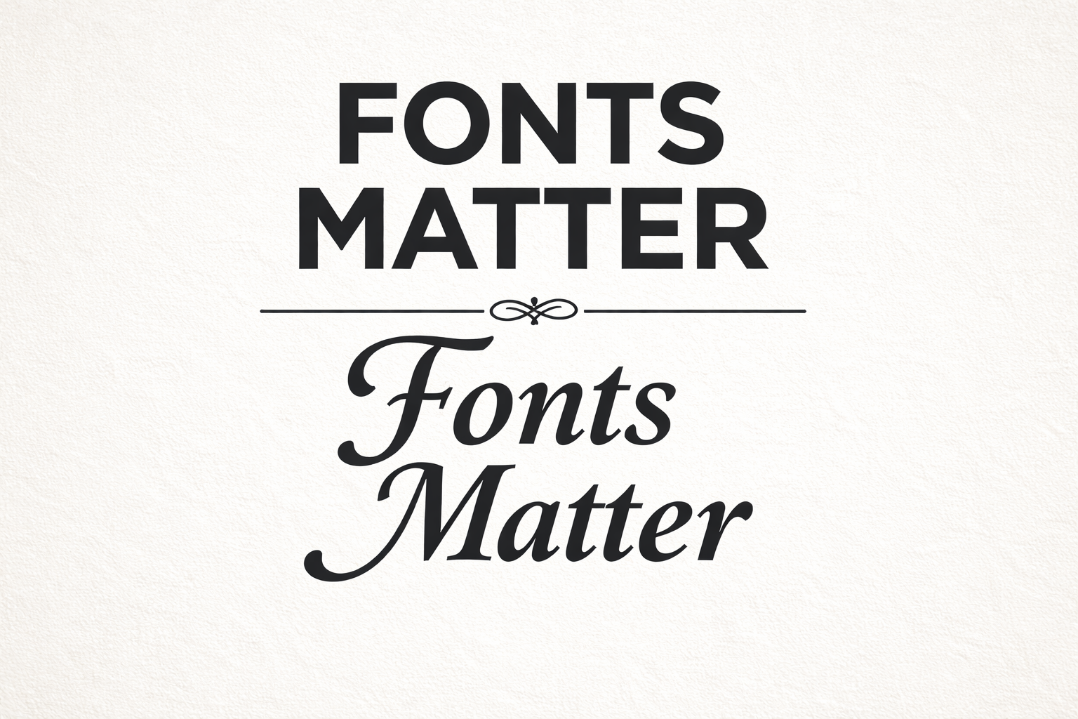
The image accompanying this article was created by the AI tool Chat GPT using a prompt by guest author Dr. Aina Irbe. The prompt was: Create an image that show a sans serif font and a serif font saying “fonts matter.” In the image the words in sans serif font are bolded and above the serif font words in italics.